So as I’ve previously mentioned in a few of my past posts, I’m rebranding Mind The Windows, focusing on the redesign of the website and how it can translate to other digital/social media platforms. The biggest thing I’ve been trying to do with the website lately is create a hierarchy of information which entices the visitor to look further, while also creating a clear navigational system for the user who may already know what sort of story he’s after.
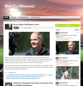
Currently, Mind the Windows looks like this:

Hosted through WordPress (although, goodness knows WordPress is wonderful when used well), the site looks like your average blog, however there is more to it. It is a news-style website, providing well researched articles from a team of eight cricket enthusiasts around the world. Thus, in order to start thinking about re-design, I had to start thinking about what it was missing, and the best way to do that is to look at other websites which also offer news articles, in order to figure out what the standard was.
I looked at a range of article based websites, from a variety of backgrounds, however I have highlighted a few below to demonstrate some of the things I thought were key features of these sites, when looking specifically through the lens of information hierarchy and how it engages with it’s audience, as well as the navigation and how easy it is to find categories at a glance.
Please note, that these observations were all made with the design of Mind The Windows in my mind. Each of these websites are actually fabulous for what they offer however I was thinking with a mindset of: Which features am I looking to include within my own site, and how can I improve them to best suit the context of Mind The Windows?
Femsplain
Also hosted through WordPress, I thought this was a good site to look at as a starting point. Their homepage, although similar in a sense where it shows excerpts from articles to entice readers, it limits the information it shares. It does this by limiting the blurb to a maximum of three lines (assuming the site is viewed at full screen on a laptop, although it does change with screen size, leading me to consider whether the limit is a character count rather than line count), often taking pull quotes which are a good size to utilise as the secondary text (the primary being the title), however sometimes it can just be a sentence from the article which sets up the frame of the story. Their images compliment the stories, without commanding your attention too much, and they have chosen to remove all hashtags and categories which come with the WordPress style.
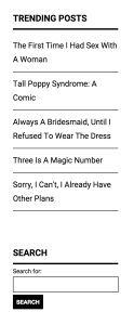
The other thing I noticed is that Femsplain has a search bar, which made me realise that Mind The Windows did not. I had already acknowledged that the site was difficult to navigate, however I had not quite realised that it was lacking this key feature. Furthermore,  they highlight popular articles which have been trending well, often from the latest month, above the search bar in order to attract further interest.*
I did feel that Femsplain lacked in terms of easy navigational systems though. It did offer a seperate page which grouped articles by monthly themes, however it wasn’t the easiest thing to find, as I had originally assumed that there wasn’t a topics grouping area. It did end up being situated under the link to the current months theme, which then redirected users to a page which displayed themes of the site since origin.
*This observation from August 2015 has since changed with the website having undergone some redesign. Reference pictures have been included to the left for an understanding of what it looked like at the time.
Flipboard
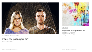
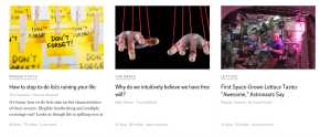
 The next site I’m looking at is Flipboard. Sing you need to have an account to look further into the site, I have included some screenshots, because honestly, I could have lived without creating an account for this site, however it was suggested to me by a friend as something they found to be a great site for providing articles of interest to them. I will admit though, this site definitely knew how to s
 how case articles that were of interest to the user. Being a sign up only website, they asked a few questions in the process about my interests, and as such, when I first logged in it had generated a bunch of articles from topics that I’d like as well as topics they thought I’d have an interest in. What I took from it, was that it was sort of like a news oriented Pinterest site. Since their topics were almost guaranteed to be of interest to the user, they opted for a minimal approach when it came to advertising the articles, often using large images, including a title of the article, where the article was originally posted, and sometimes a little blurb about the piece.
Vice
Next up is vice, what I would consider an indie news site. They have a strong use of imagery, which is complimented by the article title and small blurb, for the most part, with only titles being shown when using the navigational system as it highlights popular articles from each category. When clicked into, each topic also includes a splash page, highlighting the top article, displaying an image, the article title, and a subtitle, or blurb.
In terms of navigational functionality, they had drop down menus which highlighted sub categories, which then further highlighted popular articles from within the sub categories. They also included a search bar for more refined, or specific ideas from a reader.
The Guardian
Finally, the Guardian. This is of course, a digital version of a popular newspaper, so I was interested to see how it had adapted for its electronic form. Visually, it still looks like a newspaper. Utilising a 4 column grid structure, the site highlights important articles at the top of the page, spreading across multiple columns, while less important articles are given less space, and sometimes they are even left without a picture. One thing is for sure, the Guardian has quite a complex information hierarchy. It is interesting to note, that unlike the other three highlighted websites, the Guardian does not offer blurbs about the articles often, instead choosing to use headings as the main form of communicating the articles contents.
In terms of navigation, it offers a list of quick links at both the top and bottom of the website, while also offering more in depth links under the ‘browse all sections’ tab. There is also a search bar, and the ability to filter articles by topic. For such a large site, this complex navigational system works really well.
